State
Here we highlight visualizations that illuminate the state of networks and M-Lab measurement. These look at the framework within which network performance and transparency testing happen, and expose this in easy to understand visualizations.
-
RIPEstat Widgets to Explore Networks' Activity
RIPEstat is a web-based interface developed by the RIPE NCC featuring visualization widgets and data APIs dedicated to making sense of Internet data. RIPEstat now includes:
- The Observed Network Activity widget, which shows the distribution of actively used IP addresses within a specific country or network, during a user-defined time period. An IP address is considered “active” if it originated an NDT test.
- The Observed Bandwidth Capacity widget, which shows the bandwidth distribution within a specific country or network during a user-defined time period, as measured by NDT.
As a random example, check out the bandwidth distribution in Germany (the top chart) and the distribution of active users within 193.0.0.0/10 (the bottom chart).
-
How many M-Lab tests? How much M-Lab data?
Total number of tests and total amount of data
This table shows the total number of tests run on the M-Lab platform and the amount of data generated by those tests since January 2010.
Daily number of tests
This graph shows the total number of tests run daily on the M-Lab platform.
The other tabs (at the bottom) contain the daily number split by tool.Daily amount of data
This graph shows the total amount of data collected daily on the M-Lab platform. The other tabs (at the bottom) contain the daily total generated by a specific tool. Mousing over the graph line will show the exact total bytes collected for a given day, in the upper-right.
-
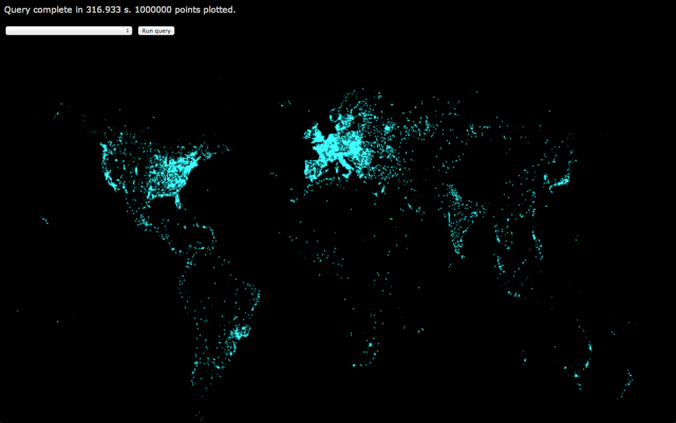
Distribution of NDT tests
Since the dawn of M-Lab (2009), see every NDT test ever run appear over time as a small dot on a vast map.

For more information about how the chart was created, see http://dominichamon.com/blog/2012/12/visualizing-m-lab-data-with-bigquery-part-two/.